The Applecado Blog

Statistics are continually showing an upward trend in mobile browsing. More people are using their mobiles and tablets to view the web, and purchases from these devices are also increasing. It would be an easy conclusion to make that we should be doing everything possible to make the user’s experience as good as it can possibly be.
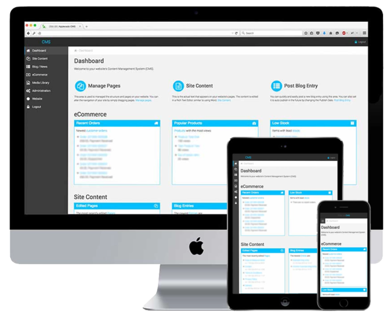
Responsive web design uses flexible imagery, and grids to determine layout, alongside some clever coding decisions to provide optimal viewing to the user; your customer. Technology allows the website to detect browser dimensions and swap content around as necessary.
The changes will be most noticeable in the site navigation and the actual page layout of content areas and pictures. The aim is to make the site easier to move through, it must be easier to read, but with minimal resizing, or panning and scrolling by those viewing it.
The most important thing to consider is speed and file size. Making your website responsive shouldn’t weigh it down, especially when you consider that mobile connections sometimes aren’t as reliable or as fast as WiFi.
For example, according to research 11% of websites are responsive, of those 72% are delivering the same amount of data regardless of the screen size.
The above statistic shows that whilst a huge amount of people offer responsive websites, not many get it right. A responsive or adaptive website should not need to load any content that is not required for the device of the user. For example, a mobile user will not need to see large parallax images or have any code for hover effects. The Javascript, CSS and images can simply be removed in that instance, bringing down the file size and load times of the site.
A responsive website design is more cost effective than having different websites for different devices. It is simpler to update, market, and analyse one website than sub-domains or across multiple platforms.
Google recommends responsive web design as one single URL for desktop and mobile visitors allows for easier indexing by the search engine’s algorithms.
Every company, and every project has a budget to consider. Responsive web design isn’t the be all and end all if budgets are tight. In such cases, it’s better to create a well built, polished and beautifully functional website that can be used by all screen sizes rather than rush to do both versions less well.
Optimising performance will provide your customers with a better mobile experience regardless of the layout. Your site’s visitors won’t wait for 10 seconds while content loads, and they won’t stick with it when the navigation isn’t intuitive.
However, consider that if your competitors are providing a better, easier and faster browsing experience, can you afford to fall behind?
Applecado have been building responsive sites for many years, we don’t just talk the talk. Get in touch with us to see how we can help you move forward.